


Finished! Looks like this project is out of data at the moment!
Results
Phase 4: Splitting up the original images, and new images to compare
Hi there, thanks for clicking on our project page!
Based on the results of the previous project phases, we are re-launching the project with new images, and a new activity!
We will post the results from this new phase here when they have been completed and the data analysed.
Phase 3 Results: Brightness equalised images
Thank you to everyone for taking part in phase 3, comparing brightness equalised images of solar storms!

Figure 3: Brightness equalised images of solar storms. This shows the three solar storms in figure 1 with brightness equalisation applied to the images.
We have analysed the results from this phase, finding similar results to phases 1 & 2.

Figure 4: The complexity of brightness equalised solar storms follows the solar cycle.
The results shown in figures 2 and 4 tell us that on average, solar storms appear differently depending on when in the solar cycle they occur.
We asked you to look at brightness equalised images, so we could determine whether it was only the brightness of the solar storm which changed throughout the solar cycle.
This result tells us that there is more changing in the images than how bright the solar storms look.
So now, we must continue to investigate! Thanks for reading - please give us a hand with phase 4 if you can!
Phase 1 & 2 Results: Solar Storm Complexity Follows the Solar Cycle!
Thank you very much to everyone who took part in the first phase of this project!
We have used your comparisons to rank 1100 solar storms by how complicated, or ‘complex’ they appear.
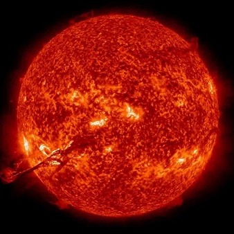
Figure 1 shows three solar storms from the ranking. The left-hand image is a less complex storm, the middle image is an average storm, and the right-hand storm is a highly complex storm.

Figure 1: Three solar storms from across the complexity ranking.
You can watch an animation of all 1100 solar storms here.
The Sun has an ~11-year solar cycle, during which the number of sunspots (and solar storms) rises and falls. This can be seen in the bottom panel of Figure 2.
The top panel of Figure 2 shows the complexity of all 1100 solar storms plotted over time, for each of the two STEREO spacecraft. We have over-plotted yearly means, which clearly show that the average complexity of solar storms follows the sunspot cycle!

Figure 2: Top panel: complexity of solar storms over time, bottom panel: daily sunspot number.
Now we have established this, we are launching the second phase of the project. In this phase we have used brightness-adjusted images, to look at the role of brightness in our complexity estimates.