


Results
Premilinary Results
While this project was created with the intention of harvesting data, it was also designed with the hope of illuminating the relative subjectivity of that data as well. The research team wanted to create a humanities-driven data experience that caused both the viewer and the researcher to question the notion that data is objective (or even true). Survey questions do not necessarily have to take the responders’ own thoughts into account, and can cause them to knowingly (if begrudgingly) misrepresent themselves and their opinions based on the possible answers. This leads to a question: to what extent can a project split the difference between harvesting workable data and exploring what happens when a survey prevents people from entering what they feel is a truthful response?
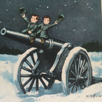
In many ways, this project's research questions seem tailor-made to explore this dichotomy. During World War One, distinctions between the domestic and the political, or the childhood and adult worlds, became permeable, shrank, or disappeared altogether. Battle maps were taught as part of the core curriculum in Kindergarten, children were groomed for a military career or for motherhood, and were encouraged to participate in the war effort as actively as possible, while the perceived safety of the domestic sphere across Europe was torn apart by invasion, artillery, the death of loved ones, the encroaching presence of the war into private life, and an increasingly present State. In short—there is no easy way to categorize different environments and spheres present during the war, because they cannot be easily extricated from each other. All of this is compounded by the fact that WWI was arguably the first (European) instance of mass media campaigns and propaganda that were used to create a war experience that was present all the time, everywhere.
This is a very long way of explaining that the surveys were designed to make its users struggle with the ‘right’ categorizations, as the ‘right’ categorizations do not exist. Nevertheless, they should still yield data—data that has been coerced into looking clear-cut. The ‘simple’ quantitative questions (how many children, where are they, what is the message) should provide a fairly clean dataset caused by chaos (one volunteer who has spent time with the project today generally called the categorization process “tricky”). The second question set, which asks the responders to say how they feel looking at the image, will supply perhaps the only ‘accurate’ data from the survey—which will be entirely subjective and difficult to map. Even a word cloud faces some hurdles, as the responses thus far have ranged from one-word answers to entire paragraphs. The original hypothesis was that the quantifiable questions (how many children, where are they, what is the main goal) would provide very ‘symmetrical’ data: there would be more images with a few children than with many or none, the environments would be evenly split between domestic and war, and the main goals would be well-distributed (no one answer would be dominant over any other).
In the end, I made a series of visualizations. First, I made deliberately basic visualizations of the ‘clear-cut’ survey data:


Immediately, these visualizations show how wrong some of the initial hypotheses were. It is striking, for instance, by how fully one third of the images had no children. Rather than seeing this as an oversight in media collection, I am excited by what this means for the lack of child protagonists in stories and media created for children. I am also curious to interrogate all of the user-submitted short answers to see if anyone mentioned seeing soldiers or youth—perhaps the viewers define children differently than I do. The first tree map (which environment) conforms a little more closely to what I’d imagined (slight war dominance, good showing for the domestic front, everything else disappears). I’m intrigued by its aesthetics , and I wonder how I could re-create this image to function slightly more like a map (these proportions overlaid onto a map of imperial-era Germany, perhaps). The final tree map offers as many questions as it does answers: how many people chose ‘create a positive image of the war’ despite hating what they saw, how many answered ‘depict everyday life’ for wartime events, whether the ‘dehumanization’ option would be fuller if the survey had taken into account the text elements of the images. Of the three, it is certainly most representative of the chaotic, subjective nature of this data being forced into something tidy: it looks organized, but serves only to illustrate the ways in which this survey cannot illuminate the motives of the images themselves other than to organize them by how a modern audience perceives them.
The second set of visualizations took a looser approach to data interpretation in hopes of giving some voice to the uncertainty occluded by the first set. To begin with, I generated a simple word cloud of short-answer responses:

From here, I adapted this into an image cloud that mimicked the proportions of the word cloud, responded to the viewer short answers, and incorporated my own interpretations. I tried to include as many of the images and objects mentioned by individual viewers as possible, or guess which image they were looking at. Obviously, this was an extremely subjective task, both in the guess-work and in trying to pick elements of images that reflected what the viewers saw. I, for example, am entirely unsure as to anything in this image set that reads as nostalgic (for whom? about what?), but I still did my best to reconstruct what I believed the viewers saw. This dataset, then, is my interpretation of the viewers’ interpretations of historical images out of context—a nesting doll of subjectivities.

Nevertheless, the visualization was created with data in mind. Images are sized according to their prevalence in the word cloud, and the visualization itself is organized as a nested bar graph, progressing from domesticity/nostalgia at the bottom to a collaged war scene (full of happy, smiling children) that dominates the middle, with the smallest section (mourning, frustration) occupying the top of the image. Though it is difficult to see, all of the collaged elements are placed on an archival candid photo of young German soldiers marching to a battlefield—the actual stakes, the lives and bodies of young people sacrificed to an ideology, on which all of these images rely. Finally, I chose four quotes from viewer responses as an opaque compass rose of emotions and responses: subjectivity and distress (at the top, then progressing clockwise), gender and modern perspectives, nostalgia and the innocent child, and the brutal positivity of war. Although it is perhaps too subjective or unclear to be productive out of context (how would people interpret this image without having seen my presentation or read this paper?), I’m still proud of it as an object that expresses data while questioning what data can mean beyond any individual perspective.