


June 4, 2026 - Welcome to Space Umbrella! Thank you for 2 million classifications 🎉
FAQ
How were the images made?
We use publicly available data from NASA's MMS mission to identify regions where one of the four MMS spacecraft is transitioning between magnetosphere and sheath or vice versa using a machine learning algorithm trained on MMS data. We then take data from the FPI instrument, which are included on each MMS spacecraft, for that specific time period and color the image so that more energy flux (the number of particles at a particular energy in a volume over time) is redder and less energy flux is bluer.
What are the images of?
The images are of the ion (positively charged particle) energy flux as a function of time. We expect that different plasma regions (magnetosphere versus sheath) will have different patterns in its ion energy flux. We see morphing patterns as the spacecraft flies through these regions. In particular, we see a very turbulent environment in the boundary layer.
How much data do you have?
We have ~50,000 minutes of data to classify and we have grouped them by year in batches of 10,000.
How did this project come about?
When we evaluated our MMS trained machine learning algorithm, we noticed we would often get classifications that switched rapidly back and forth between magnetosphere and sheath. Upon visual inspection, we quickly discovered that the algorithm was picking up the boundary layer and couldn't decide between the two classifications because they started to blend together in this region. The classifications were not quite good enough to pick up the exact boundary layer locations that we could more easily see with our eyes. We could mark different boundary layer regions, but to truly have a systematic study we wanted a method that did not rely on a single person's identification, but rather the judgement of a collective group.
What are you going to use this for?
We are going to systematically study the Earth's boundary layer to understand its position and extent. The energies and fluxes present on both sides of the magnetopause will also be studied in the context of the observation location and the solar wind conditions that we get from space weather observations provided by NOAA and NASA missions. We will also provide a list of magnetopause crossings and boundary layers classified by Zooniverse volunteers as a valuable resource to the scientific community.
For example, the location, properties, and processes of the magnetopause and boundary layers for increasing levels of geomagnetic storm intensities are of high interest. But, we also need a baseline of magnetopause and boundary layer locations and properties to fully understand these more extreme events. There may also be oddities found, especially with difficult to classify transitions, that pose new questions for us to explore using this large dataset.
What happens to the classifications?
In order to use the wisdom of the crowd, we have at least 10 volunteers evaluate each image. We collate everyone's response for the same image and create an agreed upon classification. We then take the data from all the images and connect them back to the specific time and location of the spacecraft at that time and use that to study the position and properties of the Earth's boundary layer.
Why do you need Zooniverse participants?
Boundary layers look different depending on different solar wind conditions (just like the clouds looking different with varying weather patterns). This variability makes it extremely difficult to automatically identify with software. The human eye can pick up nuanced patterns with ease. We need help picking out these patterns in 8 years of data.
What am I looking at in the figures?
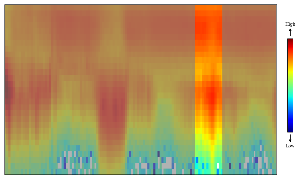
Example figure you will see in this project
The figure above shows data from NASA’s Magnetospheric Multiscale (MMS) mission. It displays energy flux, which tells us how many particles at a certain energy are measured over time. Brighter colors mean more ions or stronger energy flux. This data is collected by the Fast Plasma Investigation (FPI) instrument.
The y-axis shows particle energy on a logarithmic scale, and the x-axis shows time. The full plot covers 10 minutes, with one minute highlighted for classification.
What do I do if I'm not sure what classification to choose?
Check out our Field Guide, which includes expert examples and explanations of common pitfalls. If you’re still unsure, that’s okay—there is no answer key. Just make your best guess. We rely on many people working together to reach the best overall result.
How did you make the logo?
The logo and cover page art were generated by GPT.
How can I learn more?
Check out the "Education" tab for some additional information and feel free to ask questions in our "Science" discussion board. We'll be updating the results from your classifications regularly, so check out the "Results" tab periodically.
How is this project funded?
This project is funded by a NASA Citizen Science Seed Funding Program Grant (#80NSSC25K7015).