Zooniverse Talk
When users label a subject set with any of the line/shape/rectangle/etc. tools, if there is a lot of variation between users on a given subject image, how can the label be reduced to result/combine as the 'best' answer?
Specific example:
One user marks an image with 7 rectangles, with three overlapping labels.
Another marks with 3, no overlapping.
A third marks 5 with two overlapping.
None of the users rectangles match the rest in regards to exact dimensions/centroids.
Subject Set Reduction with Inconsistent Labels
When users label a subject set with any of the line/shape/rectangle/etc. tools, if there is a lot of variation between users on a given subject image, how can the label be reduced to result/combine as the 'best' answer?
Specific example:
One user marks an image with 7 rectangles, with three overlapping labels.
Another marks with 3, no overlapping.
A third marks 5 with two overlapping.
None of the users rectangles match the rest in regards to exact dimensions/centroids.
3 Participants
4 Comments
The display of the tutorials is better this morning but only partially fixed. As far as I can see, the sole Mapping Change tutorial and all (active) tutorials for workflows on the NfN Plants menu are fine - the images and text are shown in a single column, using the full width of the popup window, and with no overlap of information from one step to the next (these tutorials have many steps, so if overlap was still happening, it would be obvious).
But two other NfN tutorials are still shown in a two-column format.
The one that I noted above as having a much narrower window than in the past has returned to a "normal" sized popup window, but is still shown in two very narrow columns (Butterflies menu, workflow 6563). Note how narrow the columns are: even the caption in the "Let's Go!" button is wrapped. Screenshot of Step 1 - and Step 2.
And this one (Bugs menu, workflow 6569) also shows two columns, although the left column is now wider than the right. Because this tutorial has 3 steps, the overlapping text is evident.) Step 1 - Step 2 - Step 3
Another thing I noticed in the Step 3 display is that the link in the "Mountains" paragraph does not wrap to fit on the screen (the link is fully present and takes you to the right site if you click it.), while the other links are wrapped as you would expect. While I never noticed this before, I can't honestly say that this link was ever correctly wrapped. The same link also used in one of the Plants tutorials, and runs off the right side of the display there too, although everything else there is once again rendered correctly.
Problem with displaying Tutorial steps
The display of the tutorials is better this morning but only partially fixed. As far as I can see, the sole Mapping Change tutorial and all (active) tutorials for workflows on the NfN Plants menu are fine - the images and text are shown in a single column, using the full width of the popup window, and with no overlap of information from one step to the next (these tutorials have many steps, so if overlap was still happening, it would be obvious).
But two other NfN tutorials are still shown in a two-column format.
The one that I noted above as having a much narrower window than in the past has returned to a "normal" sized popup window, but is still shown in two very narrow columns (Butterflies menu, workflow 6563). Note how narrow the columns are: even the caption in the "Let's Go!" button is wrapped. Screenshot of Step 1 - and Step 2.
And this one (Bugs menu, workflow 6569) also shows two columns, although the left column is now wider than the right. Because this tutorial has 3 steps, the overlapping text is evident.) Step 1 - Step 2 - Step 3
Another thing I noticed in the Step 3 display is that the link in the "Mountains" paragraph does not wrap to fit on the screen (the link is fully present and takes you to the right site if you click it.), while the other links are wrapped as you would expect. While I never noticed this before, I can't honestly say that this link was ever correctly wrapped. The same link also used in one of the Plants tutorials, and runs off the right side of the display there too, although everything else there is once again rendered correctly.
6 Participants
12 Comments
There is no way I know of to do this with the standard project builder, and I am not aware of any experimental features that will allow this with a drawing (counting) task, though there are some collaborative tools for transcription in the pipeline that will allow different volunteers to contribute to transcription of one subject.
You could consider spreading the content of one subject into several ( ie crop images into several subjects) This can be done with or without overlap - if the images have regions which overlap between subjects this reduces lost or double counting at the cropped edges but it does make the analysis more complicated since the same objects which appear in multiple subjects have to be recognized as such (based on the location vs the overlap region).
Seabirdwatch and Penguin watch are two projects that have had this issue with counting many things. Perhaps reach out to those teams to get their experiences?
Returning to Saved Work?
There is no way I know of to do this with the standard project builder, and I am not aware of any experimental features that will allow this with a drawing (counting) task, though there are some collaborative tools for transcription in the pipeline that will allow different volunteers to contribute to transcription of one subject.
You could consider spreading the content of one subject into several ( ie crop images into several subjects) This can be done with or without overlap - if the images have regions which overlap between subjects this reduces lost or double counting at the cropped edges but it does make the analysis more complicated since the same objects which appear in multiple subjects have to be recognized as such (based on the location vs the overlap region).
Seabirdwatch and Penguin watch are two projects that have had this issue with counting many things. Perhaps reach out to those teams to get their experiences?
2 Participants
3 Comments
There was a similar post here The part of interest for you is
Drawing tools, your actual problem, can be aggregated in various ways. Most common is to use some sort of spatial point clustering using some simple clustering algorithm such as DBSCAN. This can be done on 2d and 3d points (including those for figures such as centroid or corners), though it can also be applied to areas or constructed quantities such as (area, x, y) where the constructed quantities are treated as points in some weird-dimensioned space. DBSCAN can be used on any set of data where some measure of nearness can be defined and calculated between two elements of the data set and is quite useful (example - using Levenshtein distance between strings of text as a measure of nearness allows even text strings to be clustered with a fuzzy matching determined by the clustering parameters).
Another way to aggregate figures is opacity - the idea here is you give the figure ( such as your rectangles) an opacity and place layers corresponding to each volunteers drawings in a stack, then look for the area of the whole stack which has some miminum opacity. This sounds a bit complex but is actually easy to do using some common image handling routines such as Open CV. This method effectively finds the common areas of the volunteers drawings. Using a second gate, one can measure the consistency of overlap which is a measure of the variation of the figures beyond the common area. I used this extensively for Worlds of Wonder where rectangles were drawn around illustrations with little constraint as to where the edges of a illustration were located, (and indeed if a plate was one figure or many smaller figures). Using opacity and image manipulation software also provides tools like thresholding, dilation/erosion and outer bound marking to detect and interpret overlapping figures.
For rectangle specifically you can:
- cluster on the centroids (intersection of the diagonals) - This is useful for grouping rectangles that mark the same area of interest with rectangles of various sizes but more or less centered on the same object of interest.
- use the median value of each of the calculated corner points (avoid using average which can be wildly distorted by a single fat finger or erroneous entry) This may be to used to define the consensus boundary rectangle that encloses some object (possibly after multiple rectangles have been grouped using clustering.)
- or the "opacity" approach noted above which is particularly useful for situations where one volunteer draws a big rectangle over the area and another volunteer marks the same data with two smaller rectangles covering roughly the same region.
While I have not worked with the zooniverse aggregation script I would have expected that it would give you a list for all the x's, another for all the y's and again lists for the h and values of all the rectangles drawn for a specific tool type such as "blue" rectangles, with additional lists for any other tools such as "red" rectangles. Every rectangle should have four values, and aggregation should return four lists for each tool. If not then you need to flatten and aggregate using a custom script such as this one developed for Whales as Individuals.
Working with aggregated shape data
There was a similar post here The part of interest for you is
Drawing tools, your actual problem, can be aggregated in various ways. Most common is to use some sort of spatial point clustering using some simple clustering algorithm such as DBSCAN. This can be done on 2d and 3d points (including those for figures such as centroid or corners), though it can also be applied to areas or constructed quantities such as (area, x, y) where the constructed quantities are treated as points in some weird-dimensioned space. DBSCAN can be used on any set of data where some measure of nearness can be defined and calculated between two elements of the data set and is quite useful (example - using Levenshtein distance between strings of text as a measure of nearness allows even text strings to be clustered with a fuzzy matching determined by the clustering parameters).
Another way to aggregate figures is opacity - the idea here is you give the figure ( such as your rectangles) an opacity and place layers corresponding to each volunteers drawings in a stack, then look for the area of the whole stack which has some miminum opacity. This sounds a bit complex but is actually easy to do using some common image handling routines such as Open CV. This method effectively finds the common areas of the volunteers drawings. Using a second gate, one can measure the consistency of overlap which is a measure of the variation of the figures beyond the common area. I used this extensively for Worlds of Wonder where rectangles were drawn around illustrations with little constraint as to where the edges of a illustration were located, (and indeed if a plate was one figure or many smaller figures). Using opacity and image manipulation software also provides tools like thresholding, dilation/erosion and outer bound marking to detect and interpret overlapping figures.
For rectangle specifically you can:
- cluster on the centroids (intersection of the diagonals) - This is useful for grouping rectangles that mark the same area of interest with rectangles of various sizes but more or less centered on the same object of interest.
- use the median value of each of the calculated corner points (avoid using average which can be wildly distorted by a single fat finger or erroneous entry) This may be to used to define the consensus boundary rectangle that encloses some object (possibly after multiple rectangles have been grouped using clustering.)
- or the "opacity" approach noted above which is particularly useful for situations where one volunteer draws a big rectangle over the area and another volunteer marks the same data with two smaller rectangles covering roughly the same region.
While I have not worked with the zooniverse aggregation script I would have expected that it would give you a list for all the x's, another for all the y's and again lists for the h and values of all the rectangles drawn for a specific tool type such as "blue" rectangles, with additional lists for any other tools such as "red" rectangles. Every rectangle should have four values, and aggregation should return four lists for each tool. If not then you need to flatten and aggregate using a custom script such as this one developed for Whales as Individuals.
4 Participants
5 Comments
I have had a number of teams fall afoul sorting out valid records vs beta test or development records after the fact. Also when they switch subject sets and want a clean break in the data that is easy to code.
On issue with workflow version - if a volunteers logs in and begins classifying and does not log out or otherwise close the classifying session, they continue to classify with the workflow version they logged into. This is good in that running changes can be made without everyone logging out or having their session crash, but I have seen classifications submitted to an older version days after everyone else is working on a new version of the workflow.
I recently got caught on a project where the range of subject_ids in two subject sets overlapped. The one set was complete so the workflow version was augmented via Brooke's method, and the second set was made active with the new version number for the workflow. However a few volunteers continued to classify through the change in workflow version and a significant number of classifications of the new subject set were done with the old workflow version before those volunteers logged off.
Subjects are active for a workflow, not for specific version numbers of it, and retirement is by the total classifications for any version. So subject from the newly active subject set were eventually selected and shown to volunteers still working under the older workflow version.
With the overlapping subject_ids the only way to split the export was to build a listing of each subject set from the subject export (or optionally use the panoptes client) and use that to split the export records.
This issue can also be avoided with clean breaks in the subject _id range for each subject set, by careful grouping uploading and linking so the range of subject ids can be used to test for subject set directly.
On my wish list is for the data exports to include the subject set number the subject was selected from when the classification was made. That would make it easier to split out classification records by subject set without having to modify versions copy workflows or build subject set listings.
Feedback approval - Putting the project live
I have had a number of teams fall afoul sorting out valid records vs beta test or development records after the fact. Also when they switch subject sets and want a clean break in the data that is easy to code.
On issue with workflow version - if a volunteers logs in and begins classifying and does not log out or otherwise close the classifying session, they continue to classify with the workflow version they logged into. This is good in that running changes can be made without everyone logging out or having their session crash, but I have seen classifications submitted to an older version days after everyone else is working on a new version of the workflow.
I recently got caught on a project where the range of subject_ids in two subject sets overlapped. The one set was complete so the workflow version was augmented via Brooke's method, and the second set was made active with the new version number for the workflow. However a few volunteers continued to classify through the change in workflow version and a significant number of classifications of the new subject set were done with the old workflow version before those volunteers logged off.
Subjects are active for a workflow, not for specific version numbers of it, and retirement is by the total classifications for any version. So subject from the newly active subject set were eventually selected and shown to volunteers still working under the older workflow version.
With the overlapping subject_ids the only way to split the export was to build a listing of each subject set from the subject export (or optionally use the panoptes client) and use that to split the export records.
This issue can also be avoided with clean breaks in the subject _id range for each subject set, by careful grouping uploading and linking so the range of subject ids can be used to test for subject set directly.
On my wish list is for the data exports to include the subject set number the subject was selected from when the classification was made. That would make it easier to split out classification records by subject set without having to modify versions copy workflows or build subject set listings.
4 Participants
5 Comments
First a bit of a rant - feel free to skip to get to the suggestions for your case below, but project owners really need to consider these things!
Welcome to the world of citizen science. No matter the task type there are variations in the responses between volunteers - even simple yes/no questions with a clear "correct" response will receive "incorrect" responses - due to fat fingers, malicious activity, inattention, and misunderstanding. The more true uncertainty exists as to the "correct" answer, the more likely there will be variation. Some of this uncertainty is inherent - even experts may not be "certain" of the answer, but much of the spread in results comes from the interpretation of the instructions, and the quality of the training examples and explanation of what is required.
So the project owner's first line of offense must be to make the task as simple and as repeatable by various individuals as possible - examples:
- explicit instructions that clearly handle most actualities the volunteers meet,
- training examples that cover not just the easy cases but provide guidance for the harder and worse case uncertainties.
- avoiding free transcription or free drawing where ever possible for controlled vocabulary (dropdowns), and "controlled" drawings where drawing limits are clearly defined such as fitting to physical features in the images.
- breaking extended tasks into multiple simple steps - I think of it as baby stepping through the problem.
It is also important to consider what is being asked of the volunteers:
- awareness that what is "easy" and clear for an "expert" (which most project owners are) is not east and clear for a volunteer with no training - citizen science is NOT applicable to all decision processes - there are many situations it is simply not going to work.
- awareness that in the presence of uncertainty the results will often be statistically strong but weak for specific cases. Citizen science often matches up well for what an expert can do - but if the task is such the expert is "correct" only statistically - ie say gets 80% correct, then the citizens can at best match that
statistically and agreement of specific cases may be very poor.
So how the variation in responses is handled depends very much on the task type and the science or meaning of the responses.
For simple questions or survey task selections it is common to use a vote fraction cut-off - consensus is if some minimum fraction of the volunteers chose the same response - 60% is very typical for a cut-off for this sort of task. Tasks with consensus are taken as "the" answer, those without consensus may be handled in other ways such as recycled for more classifications for handed off to an"expert", or simple handled statistically by grouping them in some distribution.
Transcription tasks - especially for short verbatim transcription of text shown in an image (examples museum labels or fields on hardprint forms) requires some form of reconciliation to choose the best response of those received. Reconciliation usually requires a rules based comparison, often with fuzzy matching such as Notes from Natures reconcile.py, and at best can clearly determine exact matches between volunteers as the "correct" answer, and weight fuzzy or partial matches in some way, usually displaying the results in some form where the basis for the final answer determined by the software can be easily understood and edited as needed. The longer the free transcription and the less constrained the responses the harder it is to reconcile to a "correct" version. Sometimes all the individual responses to free transcriptions are simply recorded in some searchable way, with no attempt to come down to a single response.
Drawing tools, your actual problem, can be aggregated in various ways. Most common is to use some sort of spatial point clustering using some simple clustering algorithm such as DBSCAN. This can be done on 2d and 3d points (including those for figures such as centroid or corners), though it can also be applied to areas or constructed quantities such as (area, x, y) where the constructed quantities are treated as points in some weird-dimensioned space. DBSCAN can be used on any set of data where some measure of nearness can be defined and calculated between two elements of the data set and is quite useful (example - using Levenshtein distance between strings of text as a measure of nearness allows even text strings to be clustered with a fuzzy matching determined by the clustering parameters).
Another way to aggregate figures is opacity - the idea here is you give the figure ( such as your rectangles) an opacity and place layers corresponding to each volunteers drawings in a stack, then look for the area of the whole stack which has some miminum opacity. This sounds a bit complex but is actually easy to do using some common image handling routines such as Open CV. This method effectively finds the common areas of the volunteers drawings. Using a second gate, one can measure the consistency of overlap which is a measure of the variation of the figures beyond the common area. I used this extensively for Worlds of Wonder where rectangles were drawn around illustrations with little constraint as to where the edges of a illustration were located, (and indeed if a plate was one figure or many smaller figures). Using opacity and image manipulation software also provides tools like thresholding, dilation/erosion and outer bound marking to detect and interpret overlapping figures.
Direct me to your project I perhaps I can give you some further ideas. I can provide the various Python scripts I have for this sort of thing but they are likely too specific to particular projects to be of much use beyond the ideas used.
Subject Set Reduction with Inconsistent Labels
First a bit of a rant - feel free to skip to get to the suggestions for your case below, but project owners really need to consider these things!
Welcome to the world of citizen science. No matter the task type there are variations in the responses between volunteers - even simple yes/no questions with a clear "correct" response will receive "incorrect" responses - due to fat fingers, malicious activity, inattention, and misunderstanding. The more true uncertainty exists as to the "correct" answer, the more likely there will be variation. Some of this uncertainty is inherent - even experts may not be "certain" of the answer, but much of the spread in results comes from the interpretation of the instructions, and the quality of the training examples and explanation of what is required.
So the project owner's first line of offense must be to make the task as simple and as repeatable by various individuals as possible - examples:
- explicit instructions that clearly handle most actualities the volunteers meet,
- training examples that cover not just the easy cases but provide guidance for the harder and worse case uncertainties.
- avoiding free transcription or free drawing where ever possible for controlled vocabulary (dropdowns), and "controlled" drawings where drawing limits are clearly defined such as fitting to physical features in the images.
- breaking extended tasks into multiple simple steps - I think of it as baby stepping through the problem.
It is also important to consider what is being asked of the volunteers:
- awareness that what is "easy" and clear for an "expert" (which most project owners are) is not east and clear for a volunteer with no training - citizen science is NOT applicable to all decision processes - there are many situations it is simply not going to work.
- awareness that in the presence of uncertainty the results will often be statistically strong but weak for specific cases. Citizen science often matches up well for what an expert can do - but if the task is such the expert is "correct" only statistically - ie say gets 80% correct, then the citizens can at best match that
statistically and agreement of specific cases may be very poor.
So how the variation in responses is handled depends very much on the task type and the science or meaning of the responses.
For simple questions or survey task selections it is common to use a vote fraction cut-off - consensus is if some minimum fraction of the volunteers chose the same response - 60% is very typical for a cut-off for this sort of task. Tasks with consensus are taken as "the" answer, those without consensus may be handled in other ways such as recycled for more classifications for handed off to an"expert", or simple handled statistically by grouping them in some distribution.
Transcription tasks - especially for short verbatim transcription of text shown in an image (examples museum labels or fields on hardprint forms) requires some form of reconciliation to choose the best response of those received. Reconciliation usually requires a rules based comparison, often with fuzzy matching such as Notes from Natures reconcile.py, and at best can clearly determine exact matches between volunteers as the "correct" answer, and weight fuzzy or partial matches in some way, usually displaying the results in some form where the basis for the final answer determined by the software can be easily understood and edited as needed. The longer the free transcription and the less constrained the responses the harder it is to reconcile to a "correct" version. Sometimes all the individual responses to free transcriptions are simply recorded in some searchable way, with no attempt to come down to a single response.
Drawing tools, your actual problem, can be aggregated in various ways. Most common is to use some sort of spatial point clustering using some simple clustering algorithm such as DBSCAN. This can be done on 2d and 3d points (including those for figures such as centroid or corners), though it can also be applied to areas or constructed quantities such as (area, x, y) where the constructed quantities are treated as points in some weird-dimensioned space. DBSCAN can be used on any set of data where some measure of nearness can be defined and calculated between two elements of the data set and is quite useful (example - using Levenshtein distance between strings of text as a measure of nearness allows even text strings to be clustered with a fuzzy matching determined by the clustering parameters).
Another way to aggregate figures is opacity - the idea here is you give the figure ( such as your rectangles) an opacity and place layers corresponding to each volunteers drawings in a stack, then look for the area of the whole stack which has some miminum opacity. This sounds a bit complex but is actually easy to do using some common image handling routines such as Open CV. This method effectively finds the common areas of the volunteers drawings. Using a second gate, one can measure the consistency of overlap which is a measure of the variation of the figures beyond the common area. I used this extensively for Worlds of Wonder where rectangles were drawn around illustrations with little constraint as to where the edges of a illustration were located, (and indeed if a plate was one figure or many smaller figures). Using opacity and image manipulation software also provides tools like thresholding, dilation/erosion and outer bound marking to detect and interpret overlapping figures.
Direct me to your project I perhaps I can give you some further ideas. I can provide the various Python scripts I have for this sort of thing but they are likely too specific to particular projects to be of much use beyond the ideas used.
3 Participants
4 Comments
Hi, I recently installed galaxy zoo on my android phone. I like it very much, just a few questions:
Could you add a zoom function? Sometimes the galaxies are very small, to small to see details on my phone screen.
Why do I get different classifying options per galaxy, even if they are similar? One time I finally saw overlapping galaxies, but then the option 'overlapping' did not appear!
Questions about galaxy zoo
Hi, I recently installed galaxy zoo on my android phone. I like it very much, just a few questions:
Could you add a zoom function? Sometimes the galaxies are very small, to small to see details on my phone screen.
Why do I get different classifying options per galaxy, even if they are similar? One time I finally saw overlapping galaxies, but then the option 'overlapping' did not appear!
2 Participants
2 Comments
When using a DBSCAN clustering algorithm on the centroids (the point where the diagonals cross), one has to define the minimum number of points (min_points) that will be considered a cluster and a distance measure (eps) of how close two points have to be to be considered "near" each other and in the same cluster if there is one. Adjusting these two values is a compromise - have min_points too large or eps too small and some points that do relate to the same subject feature will not cluster and if eps is too large, points marking different features may coalesce to one cluster.
Generally when project teams analyze their data there are the majority of subjects that resolve to a useful answer - think of this like a transcription where several volunteers got it "right". Then there are subjects where useful but uncertain or incomplete answers are obtained - say a transcription where only one volunteer reports pencilled in note on a label. Then there are some subjects that no amount of analysis can sort out - faded atrocious handwritten symbols no longer in common usage that volunteers can not decipher and report differently or ignore. For camera trap type projects some subjects are just too dark/blurry/or hard to interpret....
In your example it may be that it is just not possible to cleanly separate overlapping boxes. How the teams deal with this is often based on their science case - For example WAI was a search for usable images of Humpback whale tails showing identifiable markings to track individuals - images were filtered out of many thousands first by SaS then the WAI data analysis. Bluntly, images which did not resolve cleanly where simply discarded, since there was little cost, and the entire volunteer process was to find the "useful" images. There was a great deal of redundancy and the science case could handle tossing the questionable ones, that were not likely to be suitable for the pattern matching next step anyway. In some other project though it may be important to get a useful result from every subject, and if volunteers can not resolve it with consensus then the project team may have to use other methods or specific analysis for those images.
As volunteers we are asked to expend some amount of effort on classifying each subject. It is helpful if the project teams could give guidelines of what to do in the difficult cases. Does the team monitor Talk and use the comments to note problem subjects? - many do not ( most I would say), though some like WWI Burial Cards made wide use of the talk comments for a number of specific issues. For transcription tasks with "unclear" tags turned on, are these even used? (NfN 's reconcile.py does not deal with those well at all and they should not be turned on if the intent is to use that script to resolve transcription conflicts). Many camera trap projects are using the results in only a statistical way - overall counts of species, numbers and behaviours over all the images feeding a statistical model - in many cases the hours spent by some volunteers hash-tagging every image are wasted effort.
I have been using Done&Talk to mention when I have classified a Subject like this (example), but I have no idea if that will be of any use to the project team.
Personally I think a well designed project should state up front how they intend to use talk comments, hash-tags, and what volunteers are to do when faced with issues such as overlapping drawings, or the many other things one sees mentioned in project comments. Only a few projects do a good job of this though.
Grouping multiple rectangles per subject
When using a DBSCAN clustering algorithm on the centroids (the point where the diagonals cross), one has to define the minimum number of points (min_points) that will be considered a cluster and a distance measure (eps) of how close two points have to be to be considered "near" each other and in the same cluster if there is one. Adjusting these two values is a compromise - have min_points too large or eps too small and some points that do relate to the same subject feature will not cluster and if eps is too large, points marking different features may coalesce to one cluster.
Generally when project teams analyze their data there are the majority of subjects that resolve to a useful answer - think of this like a transcription where several volunteers got it "right". Then there are subjects where useful but uncertain or incomplete answers are obtained - say a transcription where only one volunteer reports pencilled in note on a label. Then there are some subjects that no amount of analysis can sort out - faded atrocious handwritten symbols no longer in common usage that volunteers can not decipher and report differently or ignore. For camera trap type projects some subjects are just too dark/blurry/or hard to interpret....
In your example it may be that it is just not possible to cleanly separate overlapping boxes. How the teams deal with this is often based on their science case - For example WAI was a search for usable images of Humpback whale tails showing identifiable markings to track individuals - images were filtered out of many thousands first by SaS then the WAI data analysis. Bluntly, images which did not resolve cleanly where simply discarded, since there was little cost, and the entire volunteer process was to find the "useful" images. There was a great deal of redundancy and the science case could handle tossing the questionable ones, that were not likely to be suitable for the pattern matching next step anyway. In some other project though it may be important to get a useful result from every subject, and if volunteers can not resolve it with consensus then the project team may have to use other methods or specific analysis for those images.
As volunteers we are asked to expend some amount of effort on classifying each subject. It is helpful if the project teams could give guidelines of what to do in the difficult cases. Does the team monitor Talk and use the comments to note problem subjects? - many do not ( most I would say), though some like WWI Burial Cards made wide use of the talk comments for a number of specific issues. For transcription tasks with "unclear" tags turned on, are these even used? (NfN 's reconcile.py does not deal with those well at all and they should not be turned on if the intent is to use that script to resolve transcription conflicts). Many camera trap projects are using the results in only a statistical way - overall counts of species, numbers and behaviours over all the images feeding a statistical model - in many cases the hours spent by some volunteers hash-tagging every image are wasted effort.
I have been using Done&Talk to mention when I have classified a Subject like this (example), but I have no idea if that will be of any use to the project team.
Personally I think a well designed project should state up front how they intend to use talk comments, hash-tags, and what volunteers are to do when faced with issues such as overlapping drawings, or the many other things one sees mentioned in project comments. Only a few projects do a good job of this though.
3 Participants
8 Comments
Hi all
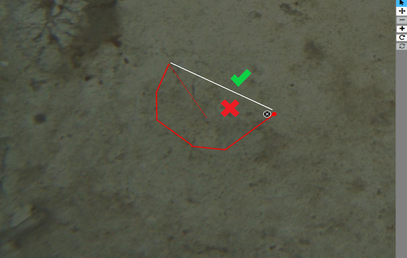
This is The Plastic Tide Team, we're using the new Freehand Segment Tool and have found some bugs.
This one in particular is preventing us from publishing our workflow.
1. Unable to draw 'inside' the segment/polygon: When using the click draw rather than the click and hold method the tool does not allow you to draw 'within' the segment or polygon. See image below:
The following are less critical
2. Closing the segment/polygon: When using the click and hold method to draw a segment/polygon it is tricky and can get messy to complete.
3. Segment/Polygon Overlaps: The ability or option to allow segments/polygons to overlap. See image:

Can you help fix bug (1) first and foremost?
Kind Regards
Peter
The Plastic Tide Team
Freehand Segment Tool Bugs
Hi all
This is The Plastic Tide Team, we're using the new Freehand Segment Tool and have found some bugs.
This one in particular is preventing us from publishing our workflow.
1. Unable to draw 'inside' the segment/polygon: When using the click draw rather than the click and hold method the tool does not allow you to draw 'within' the segment or polygon. See image below:
The following are less critical
2. Closing the segment/polygon: When using the click and hold method to draw a segment/polygon it is tricky and can get messy to complete.
3. Segment/Polygon Overlaps: The ability or option to allow segments/polygons to overlap. See image:
 first and foremost?
Kind Regards
Peter
The Plastic Tide Team
5 Participants
18 Comments
Thank you Jim!
yes, we have tested out the translation experimental support (sorry for not mentioning that earlier). It looks like a great option and solves the RTL. We did observe a couple bugs (listed below) and thought that maybe there is a way to bypass the translation tool in the meanwhile since we don't need multiple languages, but only Hebrew.
The graphic issues with the translation tool were as follows (print screens attached):
-
In question tasks with multiple choice answers, there are blue lines that stretch across the screen from each answer box.

-
In the field guide the avatars and titles overlap.
 .
.
Thanks again for your fast response!
workflow and layout modifications
Thank you Jim!
yes, we have tested out the translation experimental support (sorry for not mentioning that earlier). It looks like a great option and solves the RTL. We did observe a couple bugs (listed below) and thought that maybe there is a way to bypass the translation tool in the meanwhile since we don't need multiple languages, but only Hebrew.
The graphic issues with the translation tool were as follows (print screens attached):
-
In question tasks with multiple choice answers, there are blue lines that stretch across the screen from each answer box.
-
In the field guide the avatars and titles overlap.
.
Thanks again for your fast response!
2 Participants
3 Comments